> For the complete documentation index, see [llms.txt](https://menudocs.nx8apps.com/llms.txt). Markdown versions of documentation pages are available by appending `.md` to page URLs; this page is available as [Markdown](https://menudocs.nx8apps.com/footer-menu.md).
# Footer menu
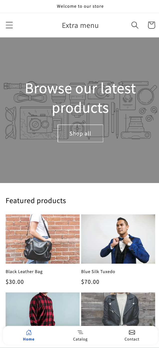
Add a sticky bottom navigation bar to your storefront on phones and tablets — like the tab bar in a mobile app. Give shoppers one-tap access to Home, Shop, Search, Cart, and more.
### What is the Footer Menu?
The Footer Menu is a navigation bar that stays pinned to the bottom of the screen on **phones and tablets**, so your most important links are always within thumb's reach. It works like the tab bar in a native mobile app: a row of up to **5 icons with labels** that follow the shopper as they scroll.
It is completely independent from your theme's own footer — it doesn't replace your footer links or change your theme. You can turn it on or off at any time.
> **Premium feature.** The Footer Menu is available on a paid plan. You can build and preview it for free — you only need a paid plan to make it live on your storefront.
***
### Before you start
To show the Footer Menu on your storefront you need two things:
1. **A paid plan** — required to publish (set a menu live).
2. **The app embed turned on** in your theme — this is what actually renders the bar. It takes one click.
***
### Step 1 — Turn on the app embed
The bar only appears once its app embed is enabled in the theme editor.
1. Open the **Footer Menu** page in the app and click **Learn more** or **Open theme editor**, or go to **Online Store → Themes → Customize → App embeds**.
2. Find **Extra menu — Footer menu** in the App embeds panel and toggle it **on**.
3. Click **Save**.
\[VIDEO: 15–20s screen recording — opening the theme editor, scrolling to App embeds, toggling "Extra menu — Footer menu" on, clicking Save.]
Back in the app, you can click **Check again** on the "Turn on the footer menu in your theme" banner to confirm it's active.
***
### Step 2 — Create a footer menu
1. Go to the **Footer Menu** page in the app.
2. Click **Create footer menu** and give it a name (this name is internal — shoppers never see it).
3. You'll be taken straight into the editor.
You can keep up to **10 footer menus** — one is **Live**, the rest are drafts you can use as backups or seasonal variations.
***
### Step 3 — Add your items
Each footer menu holds up to **5 items** (more than 5 makes each tap target too small on a phone). Every item has an **icon** and a **label**.
1. Click **Add item**.
2. Pick an **icon** and type a short **label**.
3. Choose where the item links to:
* **Home** — your storefront home page
* **Collection** — a specific collection
* **Product** — a specific product
* **Page** — a standard page (e.g. Contact, About)
* **Blog** — a blog
* **Custom URL** — any link or path (e.g. `/cart`, `/search`)
4. Drag items by the handle to reorder them.
\[VIDEO: 10–15s — adding an item, then drag-and-drop reordering two items in the list.]
> **Tip:** Keep labels to one short word (e.g. *Shop*, *Search*, *Cart*). Short labels keep the bar tidy and readable on small screens.
***
### Step 4 — Customize the appearance
Open the **Appearance** panel to style the bar. The live preview updates as you change each setting.
* **Bar background** — a solid color or a gradient.
* **Text & icon color** — the color of inactive items.
* **Active item color** — the label/icon color for the item matching the current page.
* **Active background** — an optional colored "pill" behind the current item (solid or gradient). Leave it transparent if you don't want a pill.
The active item is detected automatically from the page the shopper is on, and its label is slightly bolded so it stands out even without a colored pill.
> **Accessibility note:** the app shows a contrast warning if your text color is hard to read against the background, so shoppers can always read the labels.
***
### Step 5 — Control where and how it shows
Open the **Visibility** panel to fine-tune the behavior:
* **Hide on scroll** — the bar slides away as the shopper scrolls down and comes back when they scroll up (like Facebook). Off by default.
* **Avoid conflicts at the bottom of the screen** — automatically hides the bar when a drawer, popup, or another sticky bar (e.g. a sticky "Add to cart") is open, so nothing overlaps. On by default.
* **Lift chat widgets** — nudges chat buttons (Crisp, Tidio, Messenger, etc.) up so the bar doesn't cover them. On by default.
* **Hide on specific page types** — turn the bar off on pages where you don't want it (e.g. checkout-adjacent or landing pages).
***
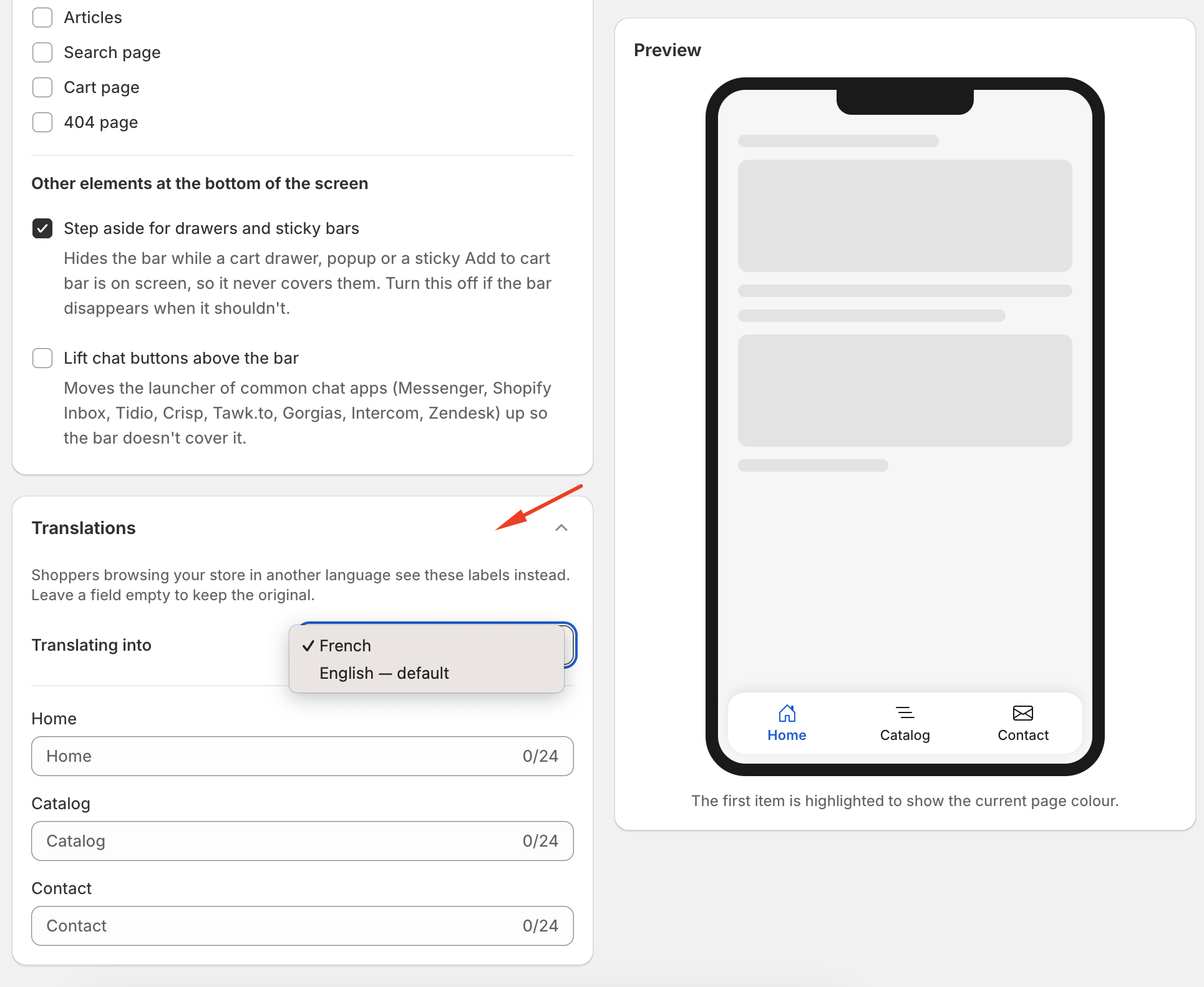
### Step 6 — Translate your labels (optional)
If your store sells in more than one language, you can translate each item's label.
1. Open the **Translations** panel.
2. Choose a language from **Translating into** at the top.
3. Enter a translation for each item. The placeholder shows the original label — leave a field blank to fall back to the original.
Shoppers automatically see the labels in their own language. Translations travel with the menu when you export, import, or duplicate it.
***
### Step 7 — Set it live
When you're happy with your menu, click **Set live** in the top-right of the editor.
* Only **one** footer menu can be live at a time. Setting a new one live automatically moves the previous one to draft.
* **Save your changes first** — "Set live" publishes what's saved, not unsaved edits on screen, so the button is disabled until you save.
* To take the bar down, open the live menu and click **Move to draft**. Your menu is kept — it just stops showing on the storefront.
***
### Managing multiple menus
From the **Footer Menu** list page, use the **…** menu on any row to:
* **Set live / Move to draft**
* **Duplicate** — great for seasonal or A/B variations
* **Rename**
* **Export** — download the menu as a `.json` file
* **Import** — upload a `.json` file to recreate a menu (including its translations)
* **Delete** (the live menu can't be deleted until you move it to draft)
***
### Frequently asked questions
**Does the Footer Menu show on desktop?** No — by design it only appears on phones and tablets, where a bottom bar is most useful.
**Will it replace or change my theme's footer?** No. It's a separate bar that sits on top of your storefront and doesn't touch your theme's footer links.
**I enabled the app embed but nothing shows.** Make sure you have a menu **set live** and that you're viewing the store on a phone/tablet-width screen. If you're on a paid plan and it still doesn't appear, click **Check again** on the banner.
**What happens if I downgrade to the free plan?** Your menus and settings are kept, but the bar stops showing on your storefront. Set a menu live again after you upgrade to bring it back.
**Can I use more than 5 items?** No — 5 is the maximum so each item stays large enough to tap comfortably on a phone.
{% embed url="" %}
### Cart button
An item that links to the cart can either open the cart page or open your theme's own cart drawer, so a shopper who adds something keeps their place on the page instead of being sent away from it. Choose between them under **edit an item → Links to: Cart**.
Most themes need nothing else. If your theme's drawer doesn't open, you can point the app at its cart button yourself — by clicking the button on your own storefront rather than by writing any code.
[Open your theme's cart drawer from the footer bar →](#cart-button)